Following a process is a widely recommended way to conduct CRO in the industry but the ‘let’s test that’ and ‘battleship’ type attitudes are still prevalent.
Your first step is to follow a process.
- Explore
- Determine your business objectives
- Set KPIs
- Gather quantitative and qualitative data
- Analyse
- Identify problems
- Develop hypotheses
- Validate
- Create designs
- Build tests
- Run tests
- Analyse results
- Learn
- Document
In between the explore and validate stages (once you have found all the issues you want to test and created hypotheses for them), the next step is to prioritise. This is usually done using a particular methodology or calculator, like the PIE method (rate the Potential, Importance, Ease).
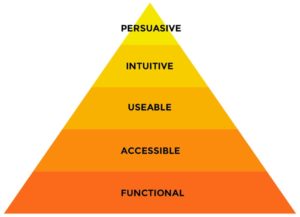
The hierarchy of conversions is lesser known and something I think is widely missing from most CRO programmes. Much like Maslow’s hierarchy of needs you need to build one on top of the other. This is a foundational piece, and I always start there with my clients.
The truth of the matter is, it won’t matter how persuasive you are if your site doesn’t work, or people hate using it.
Even though the persuasive changes (the tip top of the pyramid) often yield the highest gains, you need to put all of the lower parts of the pyramid in place before you can effectively pull them off. Clients usually want to start there, because it seems like the most fun and feels like the place they can get the biggest bang. But the truth of the matter is, it won’t matter how persuasive you are if your site doesn’t work, or people hate using it.

Functional
Does your site work and do what it’s supposed to? Can people use your site on any device? Is it:
- Free of Bugs
- Able to work on multiple browsers and devices
Accessible
Can users of all skill levels use your site? People with handicaps? Are there any barriers to using it? Are there:
- Alt tags on all images
- Readable font sizes
- Buttons with sufficient contrast between text and background
- Considerations in place to address the web accessibility checklist
Usable
Is it user-friendly? Can people do what they came to do? Have you paid attention to:
- Load times
- Learnability
- Efficiency
- Memorability
- Errors
- Satisfaction
Intuitive
Is your site intuitive to the user? Are you meeting the user’s expectations? Have you done what is needed to:
- Reduce friction
- Anticipate questions and provide answers
- Create clear, succinct copy
- Create cognitive fluency
Persuasive
Does your site convince people your product will solve all their relevant problems? Have you paid attention to:
- Tapping into psychology and emotions
- Persona targeted, effective copywriting
- Data driven design
- High quality images
When you think about websites in this sense — from the bottom up — you can see how ineffective it is to start working on persuading users they need your products if you are already losing half your visitors due to bugs, slow load times and a poor user experience.
So first things first. Build your pyramid from the bottom up, and then you’re ready to start finessing the user experience and get serious about conversion rate optimization. More on that in future blogs.

